Nature’s Palette: Using Color in Modern Rustic Interiors
Introduction
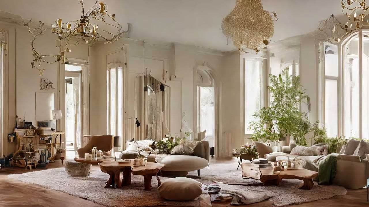
Modern rustic design has evolved beyond reclaimed wood and raw finishes. In 2025, the focus is on color—specifically, hues inspired by the natural world. Soft greens, earthy taupes, muted clays, and stone grays have become the foundation of spaces that feel both grounded and sophisticated.
Using nature’s palette allows homeowners to create interiors that are calming, connected, and timeless. This isn’t about color for color’s sake—it’s about warmth, balance, and subtle depth.
Why Nature-Inspired Colors Work
Natural colors connect people emotionally to the outdoors, creating a sense of calm and continuity. Whether it’s the quiet elegance of driftwood gray or the richness of terracotta clay, these tones invite serenity while pairing beautifully with modern materials like brass, linen, and travertine.
Key Reasons to Embrace Nature’s Palette
-
Timelessness: Earth tones never go out of style.
-
Versatility: These shades blend seamlessly across furniture, walls, and accessories.
-
Mood: Natural hues promote relaxation and mindfulness.
-
Texture Compatibility: They highlight materials like wood, stone, and ceramic.
When done right, nature-inspired color transforms a home into a sanctuary.
The Foundation: Warm Neutrals & Organic Tones
Every great modern rustic space begins with a neutral base. Think creamy whites, soft beige, warm gray, and muted sand tones. These create a versatile backdrop that allows textures and materials to take center stage.
-
Walls: Opt for linen whites or stone-inspired hues that diffuse natural light.
-
Furniture: Choose wood finishes that lean warm—oak, walnut, or reclaimed pine.
-
Accents: Add contrast with darker tones like charcoal or espresso to ground the space.
This restrained palette keeps interiors cohesive while leaving room for seasonal updates.

Layering Nature’s Accents
Once your foundation is set, layer in color inspired by specific natural elements.
1. Greens — The Color of Calm
From sage to olive, green connects indoor spaces to outdoor serenity. Incorporate it through linen cushions, foliage, or art prints. Even a subtle green glaze on a ceramic vase can anchor a vignette.
2. Clay & Terracotta — Earthy Warmth
Clay hues bring warmth and dimension to neutral rooms. Use clay jars, bowls, or small decorative trays to introduce subtle color that feels handmade and organic.
3. Stone & Travertine — Natural Elegance
Stone-inspired colors—taupe, ivory, and gray—add sophistication while keeping the palette grounded. Travertine trays or bookends embody this balance of luxury and restraint.
4. Wood & Woven Textures — Comfort Through Contrast
Woven baskets, rattan trays, and oak frames reinforce natural warmth. Their textures break up flat surfaces and add tactile depth.
How to Balance Color in Modern Rustic Spaces
The secret to a cohesive palette lies in layering and restraint.
-
Stick to 3–4 main colors per space.
-
Repeat tones in different materials—like clay ceramics, linen throws, and travertine décor.
-
Use texture as your color accent. Woven, matte, and rough finishes add visual movement even in soft hues.
-
Ground the palette with one darker tone, such as forest green or deep brown, to create definition.
The goal isn’t to overwhelm but to create harmony between tones, materials, and light.
Bringing It Together: A Room-by-Room Guide
Living Room
Start with a neutral sofa, then layer textured pillows in sage and clay. Add a travertine tray on the coffee table and woven baskets for warmth.
Kitchen
Keep cabinetry neutral, but bring in color through ceramics, stoneware, or even copper and brass accents. These metallics reflect natural light beautifully.
Bedroom
Soft greens and oatmeal linens paired with wooden nightstands and ceramic lamps create an environment of calm and comfort.
Bathroom
Pair white stoneware accessories with soft taupe walls and a travertine soap dish to create a spa-like retreat.
FAQs About Nature’s Palette
Q: Do natural tones work in small spaces?
Yes—earth tones make rooms feel open and cohesive. Choose lighter variations for walls and bring depth with darker accents.
Q: Can I mix cool and warm tones?
Absolutely. The key is balance—pair cool greens or grays with warmer tans or clay for a layered, organic look.
Q: How do I keep a neutral palette from feeling flat?
Add interest through contrast—mix matte and glossy finishes, textured fabrics, and raw materials like wood and stone.
Q: Are bold colors off-limits in modern rustic design?
Not at all. A deep green, rust, or indigo accent can add drama while staying true to the earthy theme.
Conclusion
Modern rustic interiors thrive on authenticity, and nature’s palette provides just that. By embracing organic tones and textures—stone, clay, wood, and woven fibers—you create a home that feels rooted yet refined.
This approach goes beyond color—it’s a philosophy of harmony, warmth, and connection to the natural world. In 2025, design isn’t about following trends; it’s about curating spaces that feel timeless, lived-in, and beautifully grounded.